

Redesigning the shaye.co.in Mini-cart
-
This project is part of my fall internship at Shaye. I was tasked to redesign the mini cart for the mobile (iOS) e-commerce website to promote the users to the final destination (checkout). Shaye India is an e-commerce store based in India, selling Western/Indian fusion Women’s clothing with worldwide shipping.
About the mini-cart
The Mini-cart is a virtual shopping cart that typically hovers over a page so customers can efficiently exit out of the cart to continue shopping or go straight to the main shopping cart page for checkout. It is implemented to provide an overall easier experience for browsing and shopping.
-
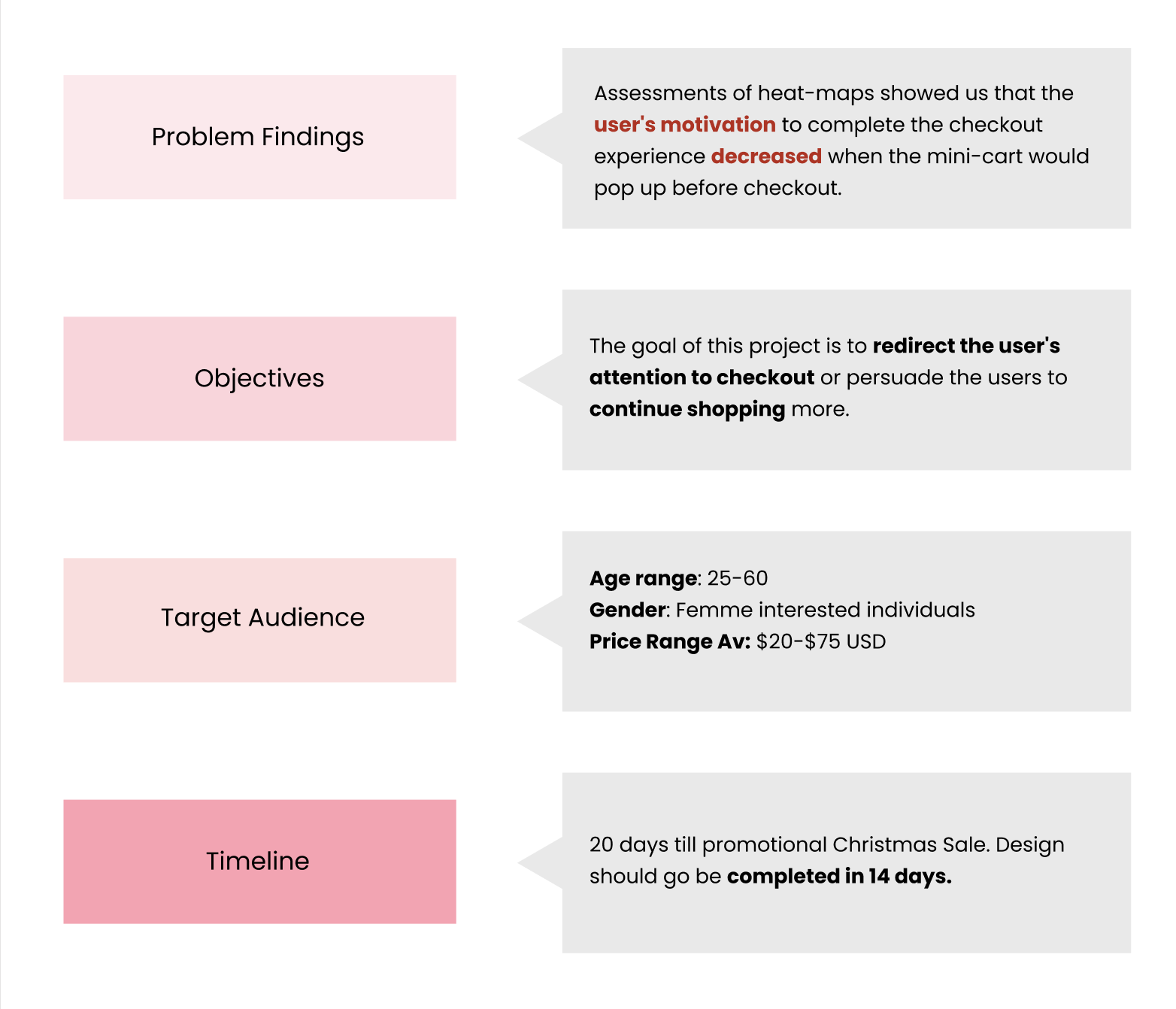
After assessing heat maps of the site on mobile (the more popular device that visits Shaye) — we noticed that user’s would abandon the website when the mini-cart would pop up. Ultimately indicating that their motivation to complete the checkout experience would decrease at the sight of the mini-cart.
-
Through competitive analysis, user interviews, journey mapping, and iterative prototyping, I independently redesigned the mini-cart to introduce features like motivating CTAs that encourage users to unlock discounts by adding more items, enhanced clothing carousels, product adaptation options, and more.
How was this achieved?
Developed a design brief to define the problem space and establish a realistic timeline for developers and stakeholders.
Conducted competitive analysis of three major e-commerce shopping experiences to explore mini-cart design possibilities.
Led user interviews with three shopper types to uncover diverse needs across demographics and shopping intents.
Translated interview insights into journey maps to identify key pain points and inform solutions.
Designed two low-fidelity prototypes and facilitated voting to select the preferred direction for further refinement.
Designed the high-fidelity prototype on Figma and sent it off to development ahead of the project deadline.
Role
Duration
Tools
Skills
Team
UX Design Intern
3 weeks
Figma
UI/UX Design
Ideation & Prototyping
Sonal Mundepi, E-Commerce Executive
Pooja Kapur, CEO
Empathize
Design Brief
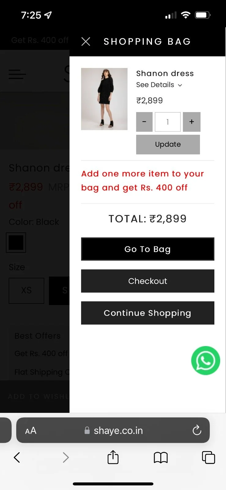
Original UI

Competitive Analysis
Key Takeaways of Competitive Analysis
The recommended products section is a new and refreshed method to get users to explore the products more in a new method using the algorithm to predict what someone would like based on what they add.
Visually seeing the product details immediately can help validate the user that they had selected the right product without completely clicking out and going to the entire cart. It is a lot more efficient.
Visual button hierarchy will make it easier to differentiate different links.

User Personas & Interviews
In order for me to gather insights into the experience of online shopping with a mini-cart, I first created 3 different user personas that would approach online shopping (1. frequently shops, 2. frequent browser, and 3. doesn’t shop frequently). I then gathered 5 participants that represent each of these personas to interview — so I could understand the full range of diverse experiences with the mini-cart, experienced by all different kinds of online shoppers.
I asked 3 questions:
What factors influence your decision to abandon a shopping cart without completing a purchase?
Are there any elements of your online shopping experience that would encourage you to proceed with your purchase?
How important is the visibility and accessibility of key information to you (such as total price, shipping options, and delivery times) in the shopping cart interface?

Interview Results
Define
I decided to take the insights from the persona interviews and brainstorm them through a journey map to better understand the comments each participant had made about different stages of the mini-cart. This helped me breakdown their behaviours, thoughts and feelings, so I could synthesize well thought out solutions that target these pain points.
Journey Map

Pain Points
The "see details" drop-down bar is too small for mobile, & is hard to navigate for older people which can prevent users from proceeding to check out.
Cant verify product information
The 3 buttons at the bottom of the cart don't follow a hierarchy and are vaguely similar enough to cause condision on how to check out the correct way.
Difficult to identify button purpose

Solutions
I then derived three main solutions that would target each pain point, as well as the needs of each of our personas. Making the product details visible directly addresses Anna (who frequently shops) so she can compare her products easily at checkout. Implementing button hierarchy helps both Priya (who browses) and Shania (who hardly shops online) by increasing motivation and likeliness to check out/continue shopping.
Lastly, we contemplated the idea of having a recommended products section in the mini cart, as that would increase browsing likelihood. However, a lot of our competitors did not include the recommended section in their mini-cart, so we knew we had to explore what would work for us personally, before we could solidify if we move forward with it or not.
Ideate
Recommendation section, or not?
I had designed two completely different mini cart sketches for people on my team to vote in which direction we should progress our design. One sketch is entirely different from the existing mini-cart and one is an adaptation of the original.
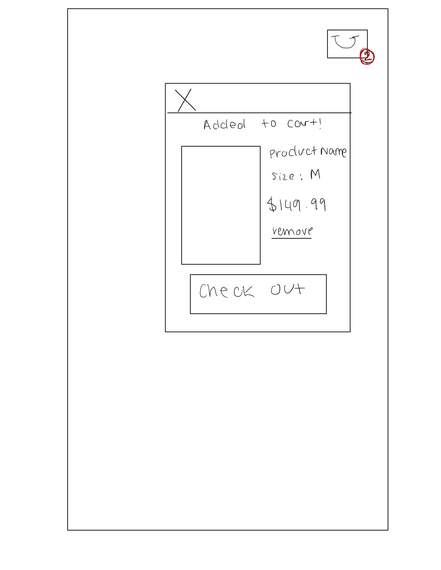

This is a pop up mini-cart thats very commonly used. The issue with this is the lack of real estate to see multiple products & recommendations to other products.
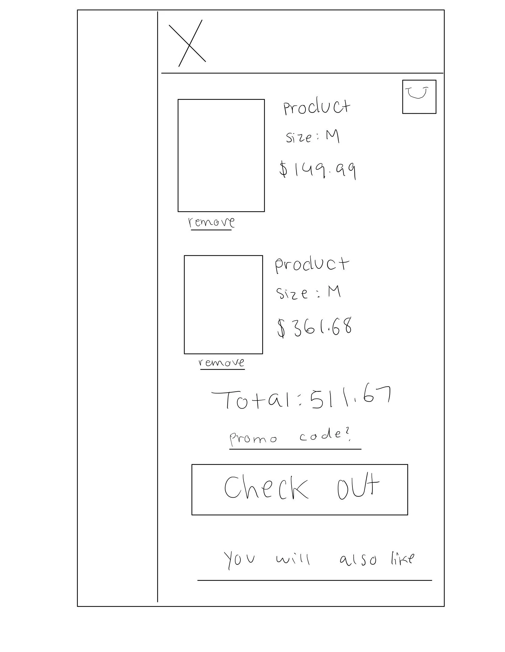

This was just about voted as the better mini-cart for Shaye as it has enough real estate to include this like multiple items in the cart, a recommendation bar and promo code. Things a start-up needs to properly market their products.
Prototype
First Iteration
Here is a map of one of my first iterations, and how I approached identifying issues and problems to improve for the next round.

Solution
Final Designs

Conclusion
My design got pushed live to the site and had an 18% increase in conversion rates.
I got tasked with many more projects such as the login page for account members, the account dashboard, and more.