

Advanced Breakdowns in AG Grids: Internal Platform
-
For over 2 decades, adMarketplace has pioneered native search advertising across the open web, connecting consumers with relevant search ads beyond the traditional search results page.
I redesigned a core part of adMarketplace’s internal platform used by account and campaign managers to track and optimize advertiser performance. This included AG Grid-powered pages like the Performance Overview, Campaign, and Audience grids. These pages surface granular metrics like CPC, ROAS, and conversions—broken down by device type, geo, time of day, and placements. This level of detail is crucial for users to spot trends, troubleshoot issues, and make data-backed decisions that directly impact ad spend efficiency and client outcomes.
-
To understand the problems, I held problem breakdown meetings with project managers, and user interviews to understand user requirements, multiple use cases that would alter the designs.
Demand Side Users need:
The ability to apply multi-level breakdown filters in a cascading format within the demand grids, enabling more granular data analysis and optimizing clarity and easy information digestion.
-
Through ideation sessions, rapid sketching, 3 user acceptance tests, 2 grooming sessions, a completed prototype of multiple use cases of different advanced breakdown scenarios, as well as a new and refined settings for users to select their ideal view was created.
How was this achieved?
Interviewed demand side employees (our users) and project managers about the breakdown hierarchies, understanding how to order it for the cascading view points.
Weighed horizontal vs. vertical cascades to address varied data consumption patterns, implementing flexible options to suit different user roles.
Designed and led task-based user acceptance testing to evaluate user interactions—such as clicks, session duration, and emotional responses—across various stages of the redesign. Tests were conducted in a controlled environment simulating real-world workflows, allowing users to approach the experience with fresh perspectives and uncover genuine usability challenges.
Led and attending developer grooming sessions, where I walk through designs as well as gain understanding on deeper technical requirements of AG grid integration and how to incorporate those into the design even further.
Role
UX Researcher + Designer
Duration
6 weeks
Tools
Figma, AG Grids
UI/UX Design
User Acceptance Test Design &
Conduction
Ideation & Prototyping
Skills
Aziza Nabiieva, UX Design Manager
Eshka-Ne Kumar, Project Manager
Tucker Nelty, Front-end Engineer
John Tenezaca, Front-end Engineer
Team
Data and information in designs are not accurate and have been altered due to confidentiality agreements
More In-depth Background
the AMPLIFY platform to monitor advertiser performance, troubleshoot issues, and optimize campaigns. I focused on redesigning high-traffic areas such as the Performance Overview and AG Grid-based views for Advertisers, Campaigns, and Audiences.
These grids present large volumes of campaign data—highlighting metrics like average CPC, ROAS, conversions, and spend. Users often need to drill down into this data by dimensions such as device type, geo, time of day, or ad placement to uncover actionable insights. For example, they may isolate mobile performance in key cities to adjust bids or analyze hourly trends to optimize delivery windows.
This granular visibility is critical. It enables users to diagnose problems quickly, double down on what’s working, and make precise, high-impact optimizations that directly affect advertiser ROI and platform performance. One key feature that supports this analysis is Compare Mode—a toggle + date picker UI that lets users compare data sets from one date or date range to another (e.g., this week vs. last week). It helps users quickly spot changes or trends over time. My redesign addressed the pain points in navigating and comparing this data—ultimately supporting faster, more confident decision-making.
THE ASK
“Redesign the Demand-Side and Performance Overview Grid to support multi-level cascading breakdowns that allow users to view data with greater granularity”


Why are we using Cascading Grids?
✅ Clear hierarchy – Cascading grids let users easily see how data breaks down (e.g., main metric → sub-groups like audience, publisher, creative) without getting overwhelmed.
✅ Progressive disclosure – You can show high-level data first, then let users expand only what they need — keeps the view clean.
✅ Comparisons are easier – The layered structure helps users compare related data side-by-side, within context.
✅ Better for large data sets – Cascading grids can handle lots of data without clutter because users control how much detail they see.
So, let’s establish a hierarchy of the different kinds of data for the cascading grid:
{Hourly, Daily, Weekly, Monthly} > {Compare Mode Dates} > {Placements} > {Operational Systems} > {Device Types} > {Events} > {Geos}
Smallest
Largest
How can I see all the statistics from Today compared to Yesterday for Placements “1-7”, in Germany and France?
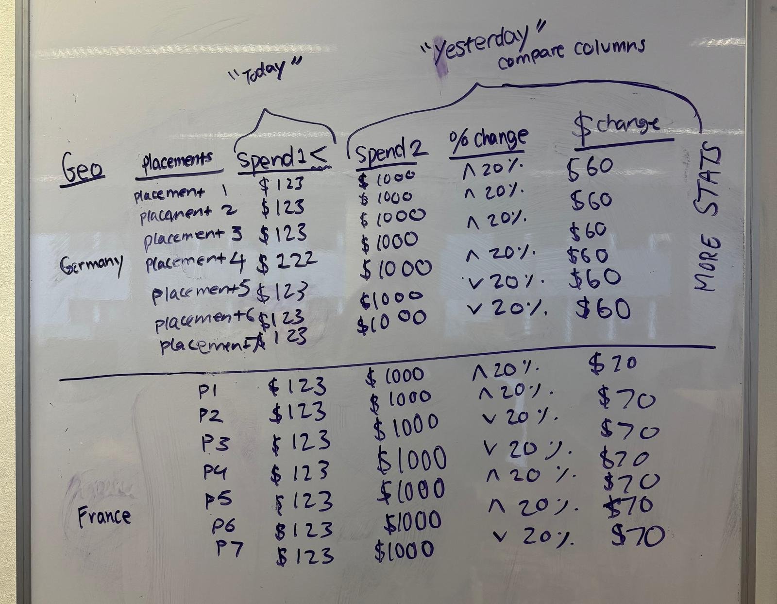
Horizontal
USE CASE for a quick grid sketch:
Users can expand columns to compare data side by side, giving a partially vertical, partially horizontal view.
VS
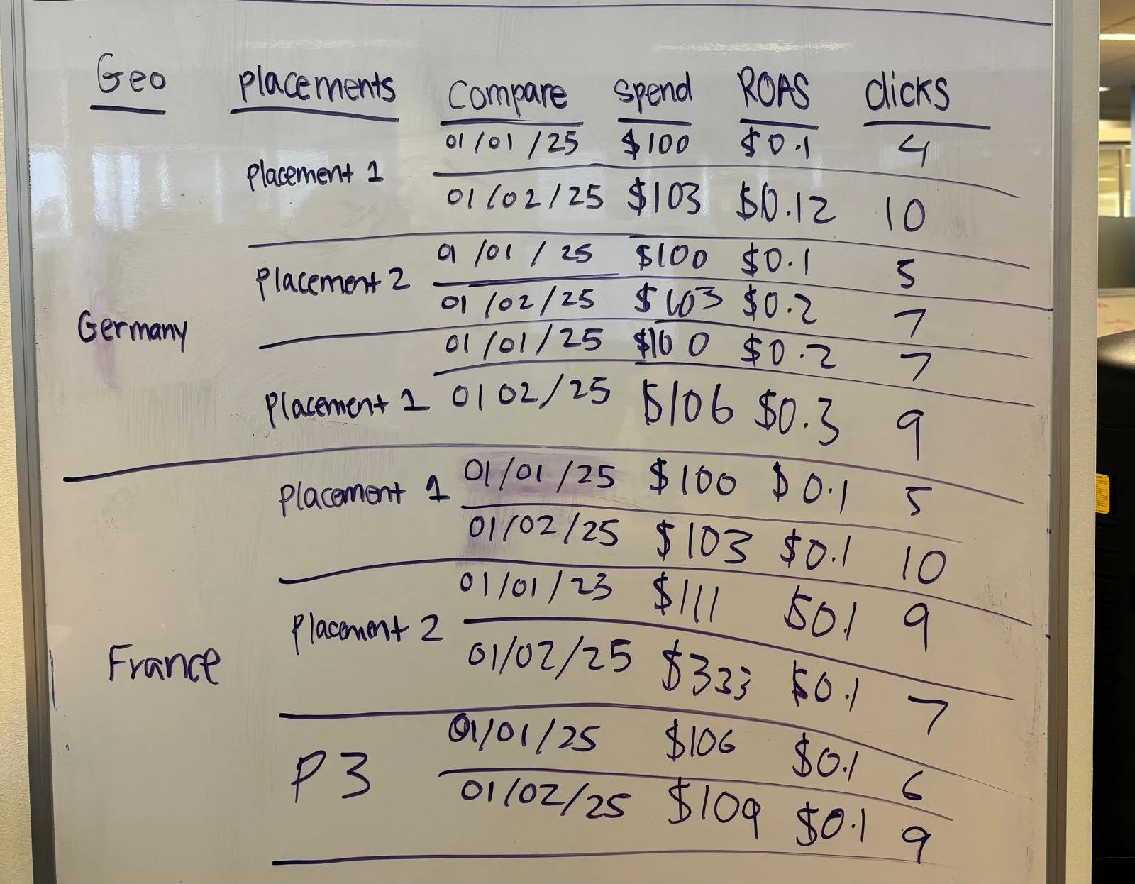
Vertical
Comparing data is stacked on top of each other, giving a fully vertical view.
So I started it mapping it out,

And made my first prototypes for both views!


Creating the User Acceptance Test
I collaborated with the project manager to design a user acceptance test (UAT) made up of five realistic tasks, each based on the day-to-day responsibilities of a campaign manager. Breaking the test into five (5) distinct parts allowed us to focus on how each of the nine (9) users interacted with individual features. Users recorded their screens and completed each task separately, with pop-ups indicating when a task ended. This structure made it easy to later review the recordings and measure time on task, click patterns, and user behavior feature by feature.

Test Findings
UX on UX: Designing a Better Testing Experience
Key learnings from building and running the test—what I would do differently next time
-
Turn off Figma “hotspot hints” to prevent users from guessing interactions based on visual cues instead of true usability.
-
Users needed clearer context to complete tasks more confidently—next time, align tasks more closely with their daily roles.
-
Validate layouts across multiple screen sizes before testing to avoid layout issues like cut-off buttons or hidden elements.
Conclusion

The Advanced Breakdowns project showed how thoughtful UX can turn complexity into clarity. By improving discoverability, aligning features with user workflows, and refining test instructions, we reduced friction across the board.
One key metric: time to access certain breakdown information whilst also being compared to other dates would take over 5 minutes and our project transformed the session time to under 30 seconds after design revisions based on user testing. This validated that even small UX tweaks—when grounded in real user behavior—can lead to outsized improvements in speed, efficiency, and confidence.
Learnings
Discoverability matters.
Users struggled to find Grid Settings because of unclear placement. Small UI shifts—like button position and label clarity—can dramatically impact ease of use.Design needs to match real workflows.
Users preferred vertical layouts and wanted to save their view preferences. Features should align with how people actually use the platform day-to-day.Testing should reflect real conditions.
We learned to avoid Figma hotspot hints, test on multiple screen sizes, and write clearer, role-relevant tasks. Better testing setups lead to better insights.Small changes can have big impact.
Task completion time dropped from over a minute to under 15 seconds with design updates, showing that even minor UX tweaks—when user-informed—can significantly boost efficiency.