E-commerce flow from scratch: Electra Fine Jewels
-
This project was completed during a freelance contract with Electra. Electra is a lab-grown diamond, fine jewelry retailer. Electra’s USP is the prioritization of serving the consumer personally through services such as customizing their own fine jewelry designs, styling appointments, jewelry maintenance, and more.
The project
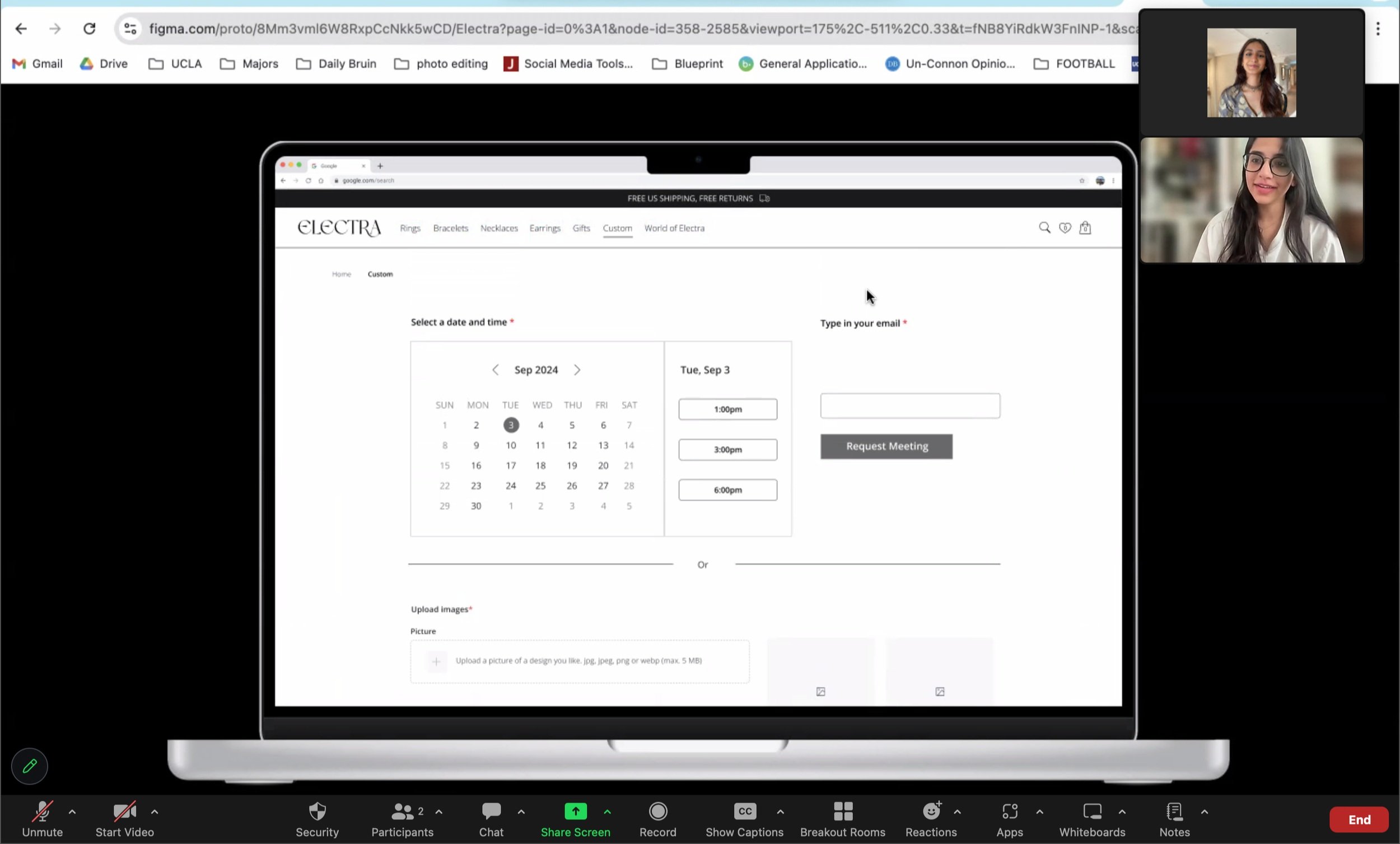
I was hired to create all the screens for the e-commerce site from scratch. This includes conducting user and market research, user testing, and low-fi and hi-fi mockups for the landing page, navigation bar, product search pages, individual product page, shopping cart, checkout, about Electra page (including blog posts), and a customizing jewelry page including a multistep form for customers.
-
Through competitive SWOT analysis, expert consultations, user interviews, journey mapping, and iterative prototyping, I led the initial UX design of a custom fine jewelry e-commerce experience in preparation for a major collaboration launch with an international actor. The redesign focused on personalizing the search and navigation process to help users efficiently discover pieces that match their preferences.
How was this achieved?
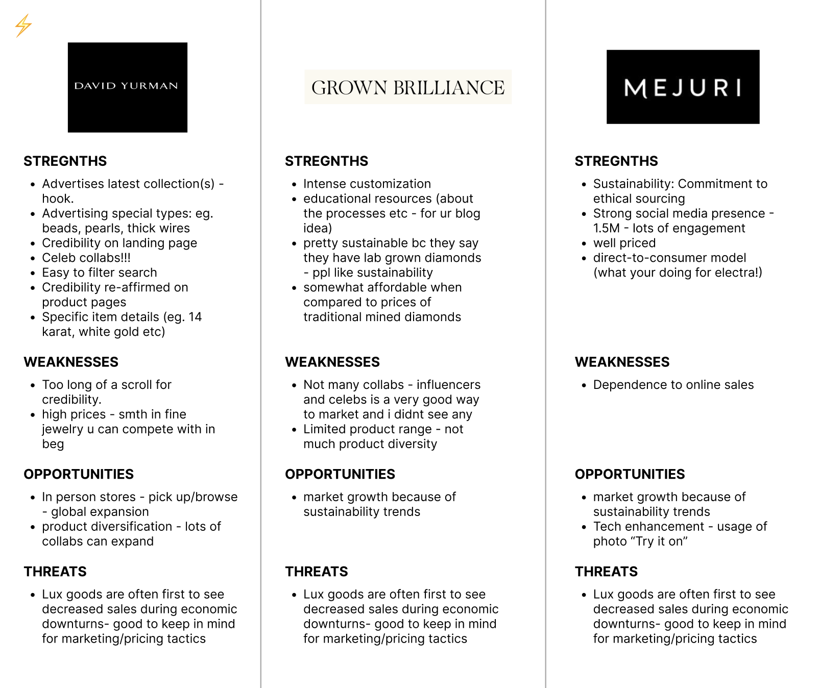
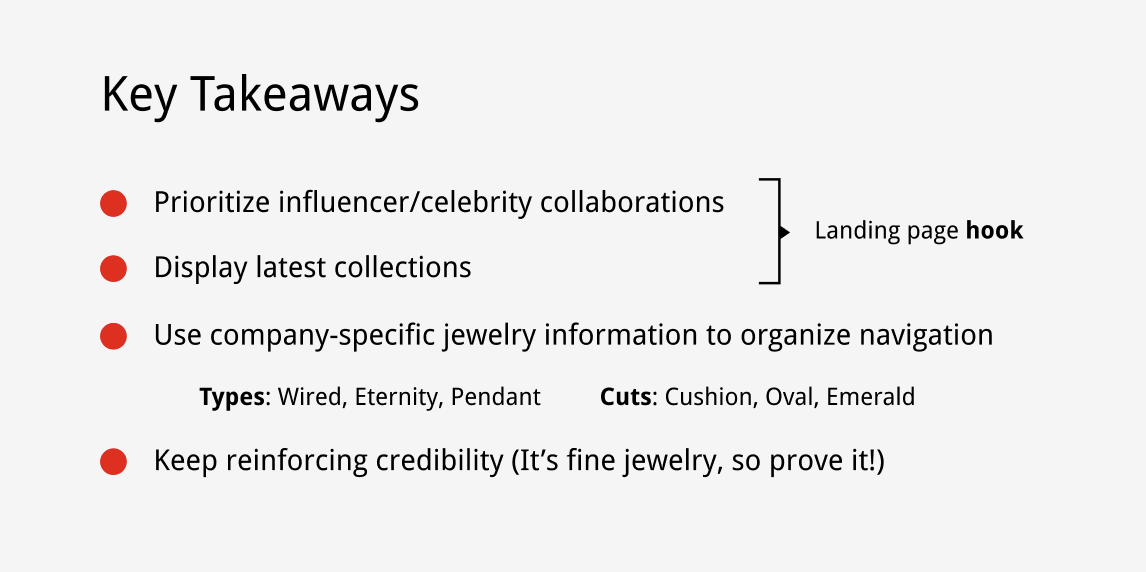
Conducted SWOT analysis of three leading online-first jewelry brands with strong social media presence to assess design strengths, gaps, and opportunities.
Consulted with 4 e-commerce design professionals to gather insights on essential features, potential pitfalls, and industry best practices.
Mapped out the end-to-end customer journey to identify critical decision points and moments of friction in the jewelry shopping experience.
Created annotated low-fidelity mockups of landing pages and key flows to explore structural solutions.
Led user interviews and usability tests focused on navigation preferences and desired personalization levels, using diagrams of navigation flows to gather feedback.
Designed high-fidelity prototypes in Figma as the foundation for development ahead of the collaboration release.
Role
Freelance UX Designer
Duration
5 weeks
Tools
Figma
UI/UX Design
Ideation & Prototyping
User Testing
Skills
Team
Priya Shah, Founder
Empathize & Define
To get acquainted with the industry and understand what was needed for the multiple screens, I started by conducting a competitive SWOT analysis by researching other fine jewelry companies.
Competitive Analysis
Industry Research and Decision-Making Process

As the solo designer for this project, I aimed to deepen my understanding of the fine jewelry and e-commerce industries to align the Electra website with market standards and customer expectations. To achieve this, I consulted with four industry experts to identify essential features for a fine jewelry e-commerce site.
Ultimately, the final decisions were made in collaboration with the CEO, focusing on what best suits Electra's vision. Below, I’ve highlighted the key features typically required for a fine jewelry website and color-coded which we deemed relevant or not for Electra.

The general journey map to a retail e-commerce experience is standardized, however, since Electra’s USP is users having the ability to customize their own jewelry, it strays from the traditional e-commerce experience slightly. Therefore, I created a journey map for the specific user that is looking to customize their own piece, so I can clearly map out how I want to approach the web design in an intuitive manner.
User Journey Map

Ideate
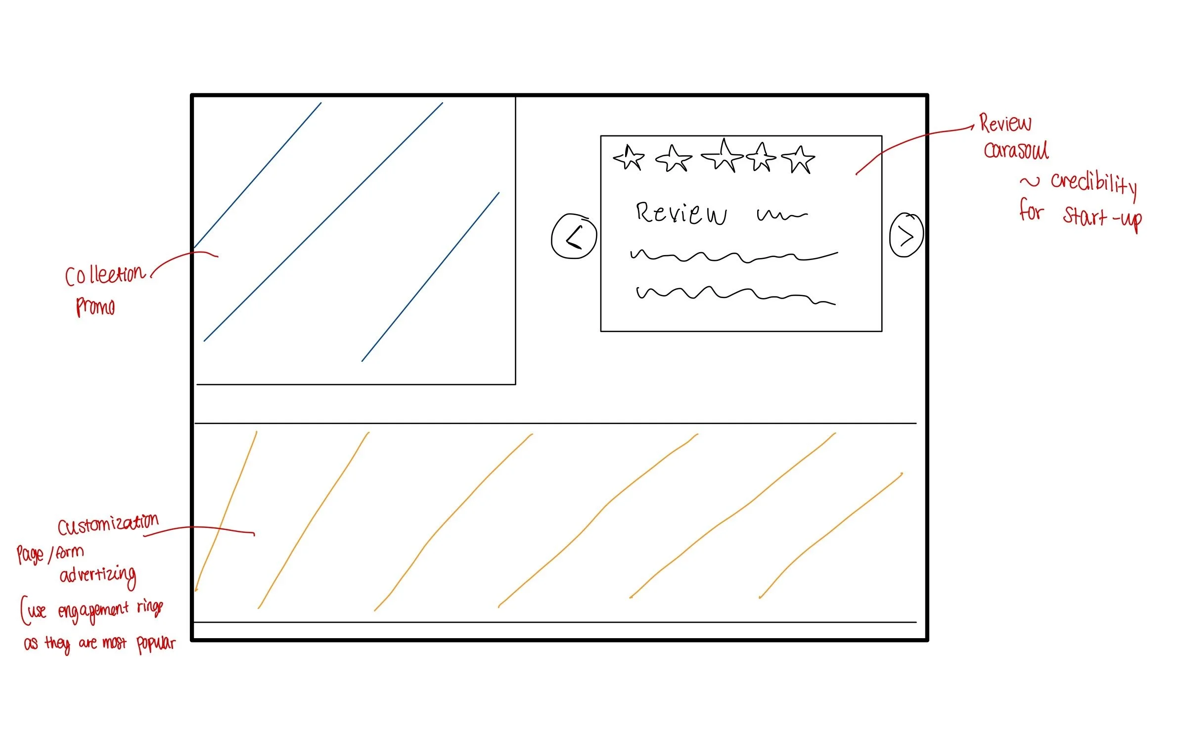
Initial Low Fidelity Mock Ups
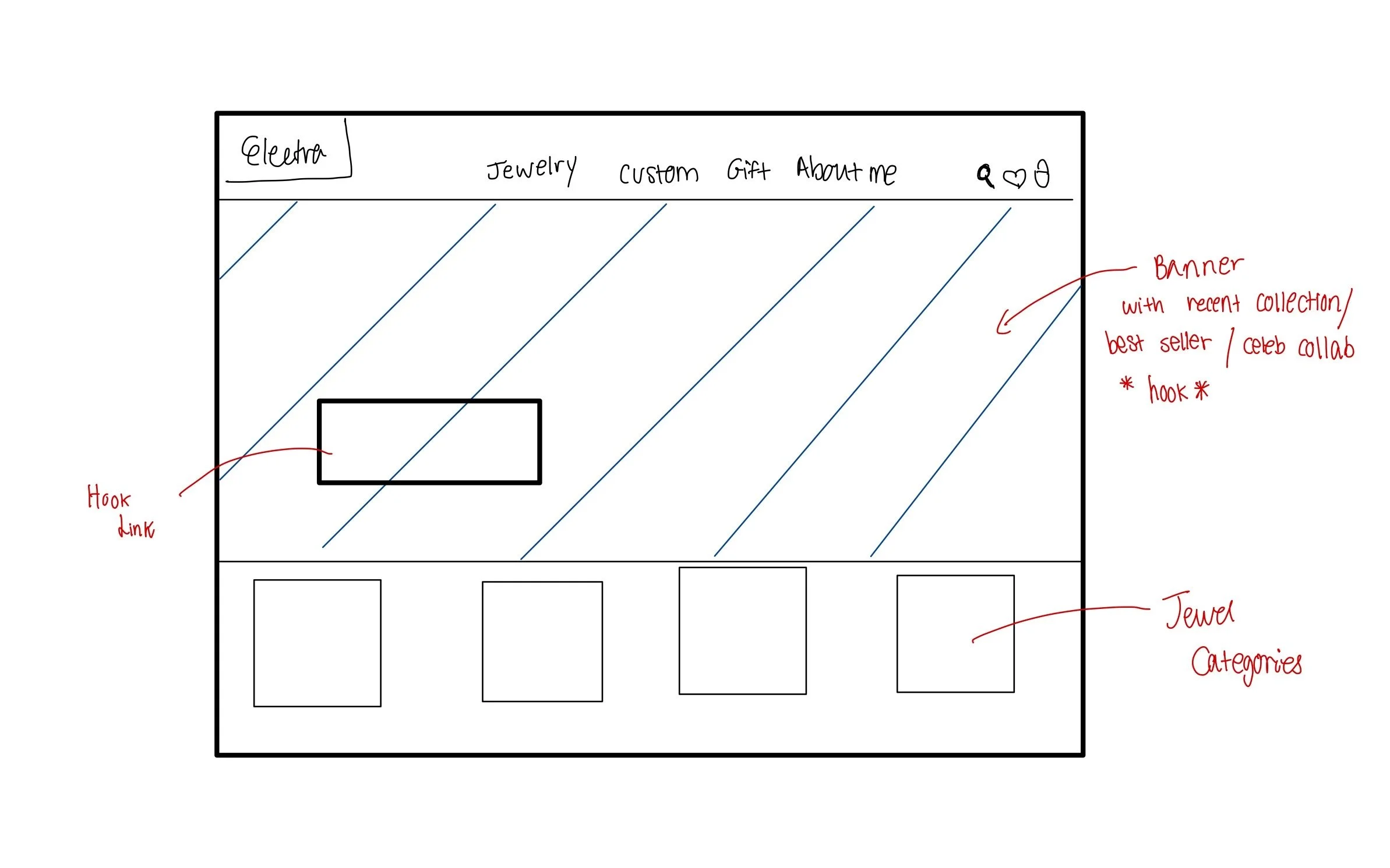
I created annotated low-fidelity mockups of the landing pages and key user flows to explore structural solutions for the site. These mockups helped visualize layout ideas early, clarify design intentions for the stakeholder, and provide a foundation for testing navigation concepts before moving into high-fidelity designs.
User Testing
As I was creating iterations of designs, I hosted usability tests and user interviews with 3 participants to deeply understand the preferred navigation flow when searching for custom jewelry. Speaking to fine jewelry enthusiasts helped me understand the level of personalization they expect in their shopping experience. In these sessions I walked though diagrams of navigation flows, and early stage mock designs to gather unexpected points of friction, confusion and general thoughts to help me visualize ways to explore the products.
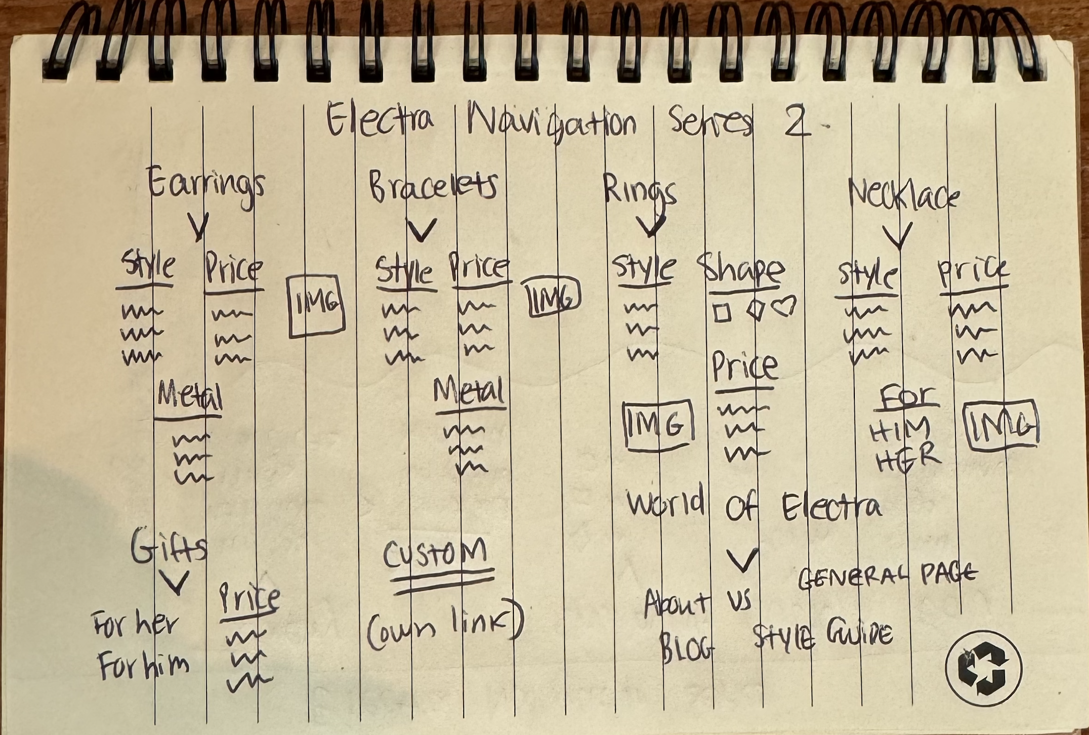
User Testing Results - Intuitive Navigation
My first ideation session for the intuitive navigation started with four main tabs: Jewelry, Shop By Cut, Custom, EDU (education). Within each main tab, there would be subtabs.
The jewelry tab was the primary one for users to hover if they were to browse, so it naturally had a lot more subtabs, making it very “hover-heavy” in that one section, making the entire navigation experience feel unbalanced.
Secondly, “Shop By Cut” is primarily associated with rings, so it wasn’t a logical decision to have it be an entire main tab.
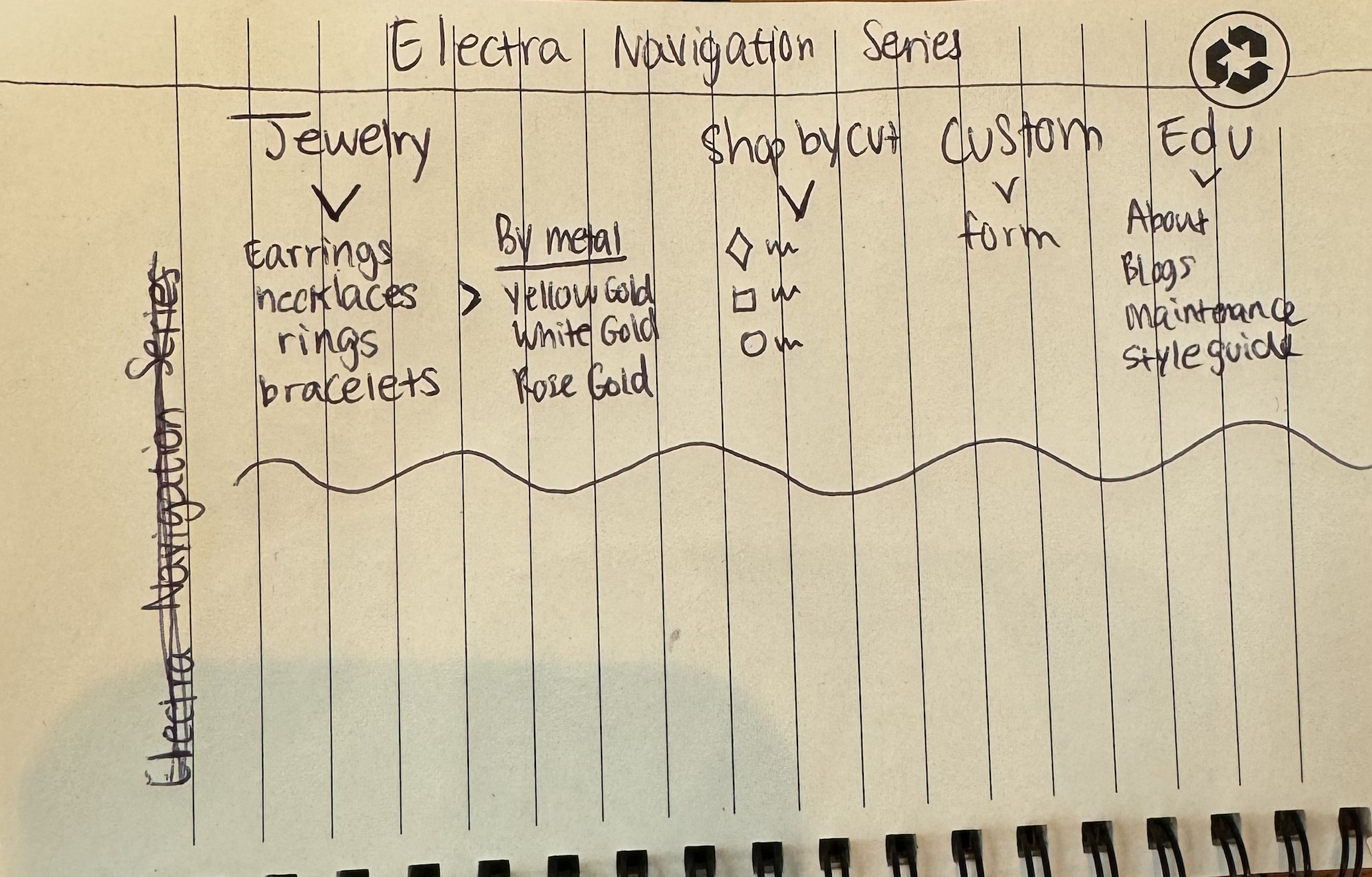

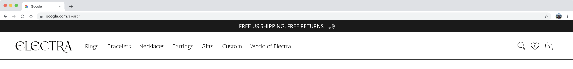
For the second and final ideation session on designing an intuitive navigation bar, we organized each main tab by product category. This structure provides a clearer, more laid-out browsing experience, allowing users to shop with intention and explore each category in detail.
By enabling more specific searches within each product category, it would ultimately lead to more relevant results and improve overall user satisfaction. Having each tab devoted to a product category also allows more room to advertise product-specific trends!
The other tabs remained the same, with an additional tab for Him and Her gifts.